Poster Designer
Typography Class
Winter, 2024

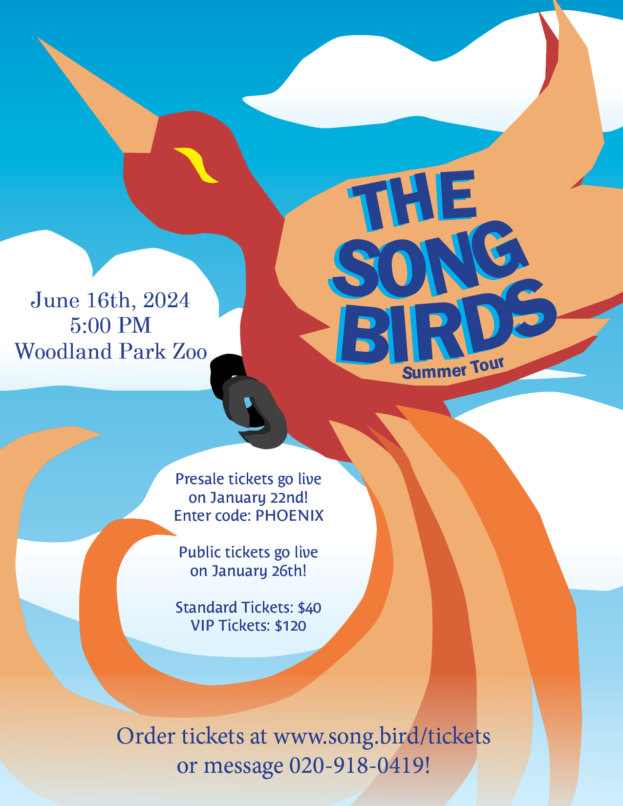
For my second typographical project, I was instructed to make a poster for any subject of my choice. This poster had to include color, text and imagery. I opted to make a poster for a fictional band dubbed 'The Song Birds', inspired by a concert I planned to go to later in the year.
My job was to create a poster of my choosing.
This project meant learning how to fully use the shape and drawing tools that Adobe InDesign has to offer and balance that alongside the use of text. The pictures could not overshadow the text, but still had to be interesting.
I ended up creating an entirely different poster on my first attempt. The initial poster was going to feature a bird feeder with birds perched on it and text to either side. I struggled with connecting to the design and making the text appealing, however.
Another challenge was making the text readable. This project has a lot of contrasting colors of different saturation, and text fades easily into the background.
Ultimately I ended up switching into a phoenix themed design. This design would take up more room and allow for larger details than the bird feeder idea. Since I was new to the program, it proved to be an easier starting point.
After a round of criticism, I determined I needed spaces that were designated for text. At that point, the clouds were added to the background. The bottom text still proved challenging, however, because of all the colors brought on b the tail. I ended up opting for a feathered, white gradient to make the text easier to read and give the effect of the phoenix bursting from the clouds.